Two quick plots to visualise gender balance in R
19 October 2015
Tweet
Here’s a quick way visualise your institution’s gender balance with two plots and a few lines of R code (available here). I’ll use my current department (Biological Sciences at Macquarie University in Sydney) as an example. I’ve focussed on plots that show the raw data, and that I hope will help convey data quickly and easily.
First we need some data. I got this from my department’s annual reports. Most departments have data available, at the very least you can usually get data on faculty just by looking at a department’s web page. To use the code below, your data should look like this (full dataset here):
In R, we start by loading a few libraries we’ll need later, and then reading in the data.
Now we need to do a bit of work to set the order of the roles. The first couple of lines below would usually be sufficient, but the kind of plot I’m doing requires me to make an additional column for the order in the third line.
Now we can make a stacked pyramid plot that shows the raw data, broken down by year and role.
You should get something like this:
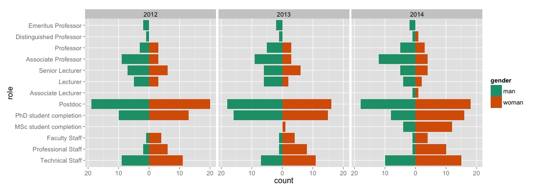
I like this plot because it transparently illustrates all of the important raw data, as well as how it’s changing over time. I don’t like this plot because it immediately shows that my department has the usual gender biases: our faculty (associate lecturers up to emeritus professors) comprises predominantly men; our students and postdocs are fairly gender balanced (NB: our MSc only just started, so the numbers are pretty small; I only have data on PhD completions, not the complete cohort; and I’m missing data on undergrads); and our professional and technical staff comprise predominently women. This is depressing, but it least it gives us a clear understanding of our current position.
Another useful way to look at gender balance is to group roles into broad categories, and to visualise whether the gender balance is different from 50/50, and how it’s changing over time. Rather than plot the proportion of both men and women (as in the famous scissor plot) I’m going to plot just the proportion of women in each category. With only two categories (we typically only record two genders, though there are many more), the proportion of any one category contains all of the information we need. Plotting a single proportion helps avoid overplotting and hopefully maximises clarity. By grouping roles into categories, we gain more power to test for gender bias, because each category will contain more data than each role (as long as the categories make sense...). I’m going to group the roles into three categories: staff, students & postdocs, and faculty. Doing that in R is pretty simple:
Now we want to count up the number of people in each category. The first couple of lines below do that for us. The third line converts the counts into a proportion of women, and the last two lines make sure that the data are ordered the way we want and in the right format:
Now we just need to add 95% confidence intervals. To do that, we can use the built in prop.test() function in R and some magic from the plyr package:
group.counts is now a data frame that has count data, proportions, and confidence intervals for the proportions:
And with this, we can make our second plot, of the proportion of women in each category, and how that changes over the three years for which we have data.
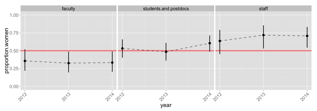
This plot reveals something that the first plot didn’t. The gender bias in faculty (mostly men) and staff (mostly women) has, for the last two years, been significantly different from a 50/50 ratio. Both have also gotten a tiny bit worse in the last couple of years (though I bet there’s no statistical evidence for that, it hardly matters in this case). Either way, the plots are not encouraging at all, and suggest we’ve got some work to do.
Here’s a quick way visualise your institution’s gender balance with two plots and a few lines of R code (available here). I’ll use my current department (Biological Sciences at Macquarie University in Sydney) as an example. I’ve focussed on plots that show the raw data, and that I hope will help convey data quickly and easily.
First we need some data. I got this from my department’s annual reports. Most departments have data available, at the very least you can usually get data on faculty just by looking at a department’s web page. To use the code below, your data should look like this (full dataset here):
In R, we start by loading a few libraries we’ll need later, and then reading in the data.
Now we need to do a bit of work to set the order of the roles. The first couple of lines below would usually be sufficient, but the kind of plot I’m doing requires me to make an additional column for the order in the third line.
Now we can make a stacked pyramid plot that shows the raw data, broken down by year and role.
You should get something like this:
I like this plot because it transparently illustrates all of the important raw data, as well as how it’s changing over time. I don’t like this plot because it immediately shows that my department has the usual gender biases: our faculty (associate lecturers up to emeritus professors) comprises predominantly men; our students and postdocs are fairly gender balanced (NB: our MSc only just started, so the numbers are pretty small; I only have data on PhD completions, not the complete cohort; and I’m missing data on undergrads); and our professional and technical staff comprise predominently women. This is depressing, but it least it gives us a clear understanding of our current position.
Another useful way to look at gender balance is to group roles into broad categories, and to visualise whether the gender balance is different from 50/50, and how it’s changing over time. Rather than plot the proportion of both men and women (as in the famous scissor plot) I’m going to plot just the proportion of women in each category. With only two categories (we typically only record two genders, though there are many more), the proportion of any one category contains all of the information we need. Plotting a single proportion helps avoid overplotting and hopefully maximises clarity. By grouping roles into categories, we gain more power to test for gender bias, because each category will contain more data than each role (as long as the categories make sense...). I’m going to group the roles into three categories: staff, students & postdocs, and faculty. Doing that in R is pretty simple:
Now we want to count up the number of people in each category. The first couple of lines below do that for us. The third line converts the counts into a proportion of women, and the last two lines make sure that the data are ordered the way we want and in the right format:
Now we just need to add 95% confidence intervals. To do that, we can use the built in prop.test() function in R and some magic from the plyr package:
group.counts is now a data frame that has count data, proportions, and confidence intervals for the proportions:
And with this, we can make our second plot, of the proportion of women in each category, and how that changes over the three years for which we have data.
This plot reveals something that the first plot didn’t. The gender bias in faculty (mostly men) and staff (mostly women) has, for the last two years, been significantly different from a 50/50 ratio. Both have also gotten a tiny bit worse in the last couple of years (though I bet there’s no statistical evidence for that, it hardly matters in this case). Either way, the plots are not encouraging at all, and suggest we’ve got some work to do.